Branding for BoxRooms
Some brands are built to sell. Others are built to mean something.
BoxRooms sits firmly in the second category.
BoxRooms is a Bury-based boxing and fitness brand built around more than just training. It’s about community, discipline and giving people a positive direction, whether that’s young people staying on the right path or adults improving both their physical and mental wellbeing.
The business has evolved over time, originally starting out in a gym in Radcliffe before moving into more focused one-to-one training. With plans to return with its own dedicated space and a broader offering, the next step was clear. The brand needed to catch up with the vision.
Where we came in
This wasn’t a cold start project. We’d been around BoxRooms from the early days, creating posters and tickets for white collar boxing events in Bury when both businesses were finding their feet.
We’d seen first-hand the environment Danny Randall had built. A former professional boxer from the Manchester Gallagher camp, alongside names like Anthony Crolla and Martin Murray, Danny had created something that felt genuine, welcoming and different.
So when it came time to move the brand forward, it made sense to work together. The vision for BoxRooms had grown. This wasn’t just about boxing anymore. It was evolving into a wider health and fitness offering, combining training with a more holistic approach to wellbeing.
The brand needed to reflect that shift.
It had to feel strong but still approachable. Modern, but not over-designed. Something that would stand out locally, without losing the authenticity that made BoxRooms what it was.
A brand built to be used
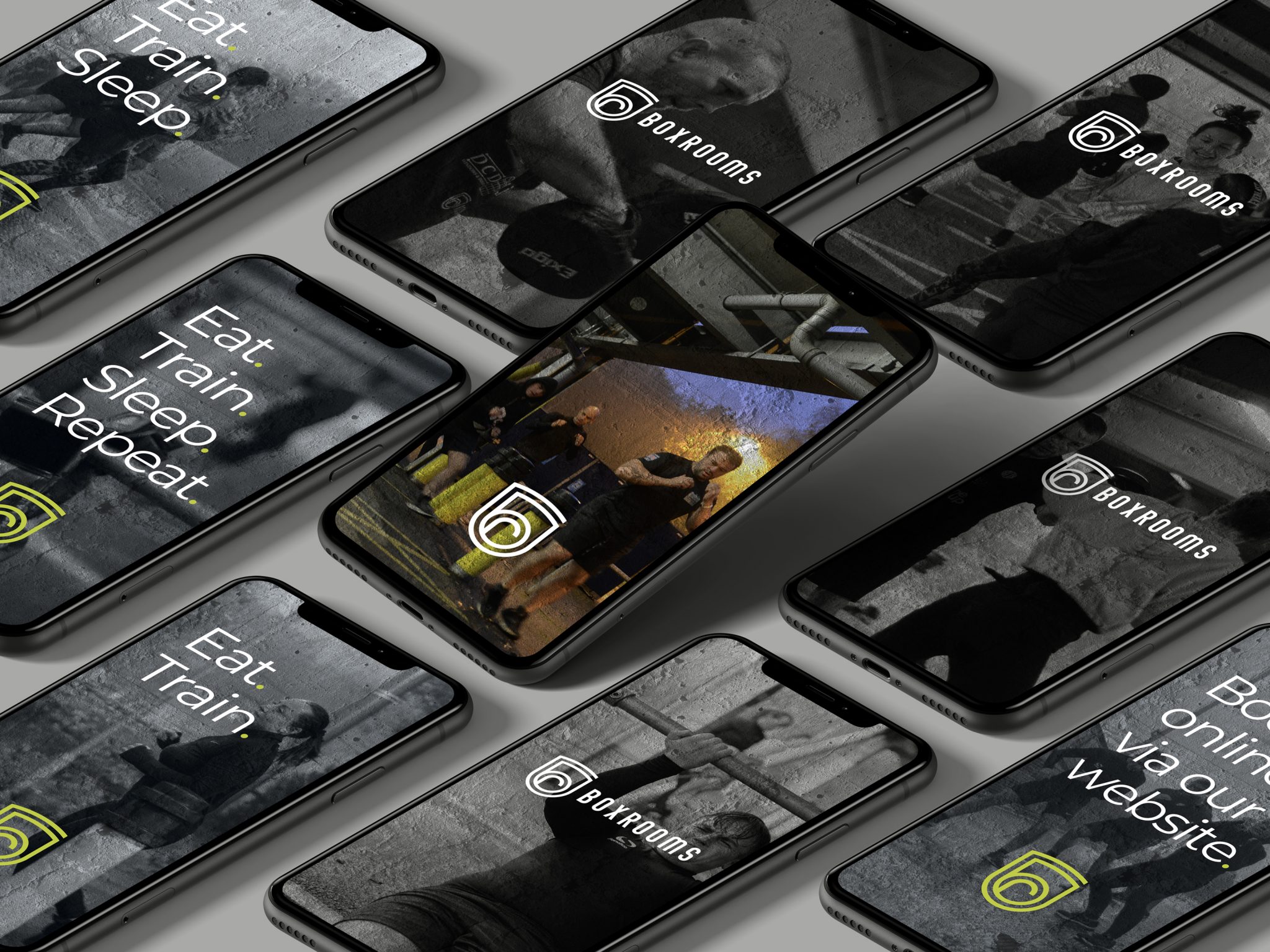
We started with the logo, focusing on creating something that would work in the real world. The direction centred around a shield-style icon built using the initials B and R. A simple but recognisable mark that could stand on its own across clothing, equipment and social content, without losing impact.
Because a good logo isn’t just about how it looks on screen, it’s about how it holds up everywhere else.
Visual direction
The look and feel of the brand was influenced by the environment it came from.
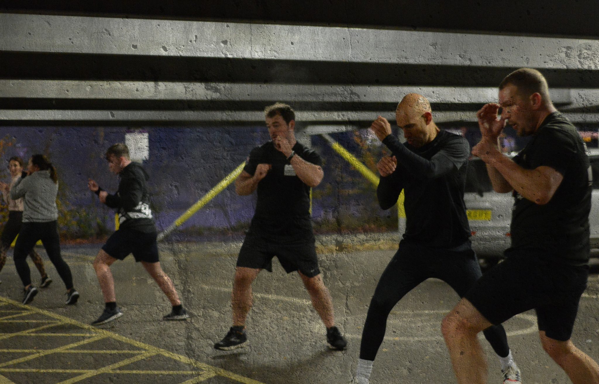
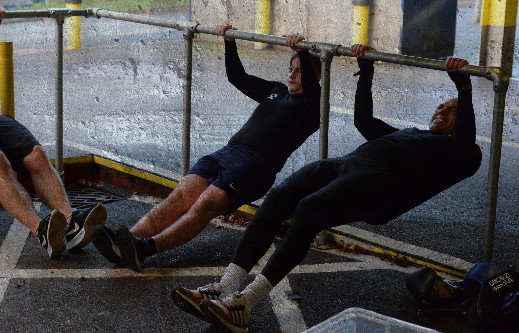
Raw, urban and honest.
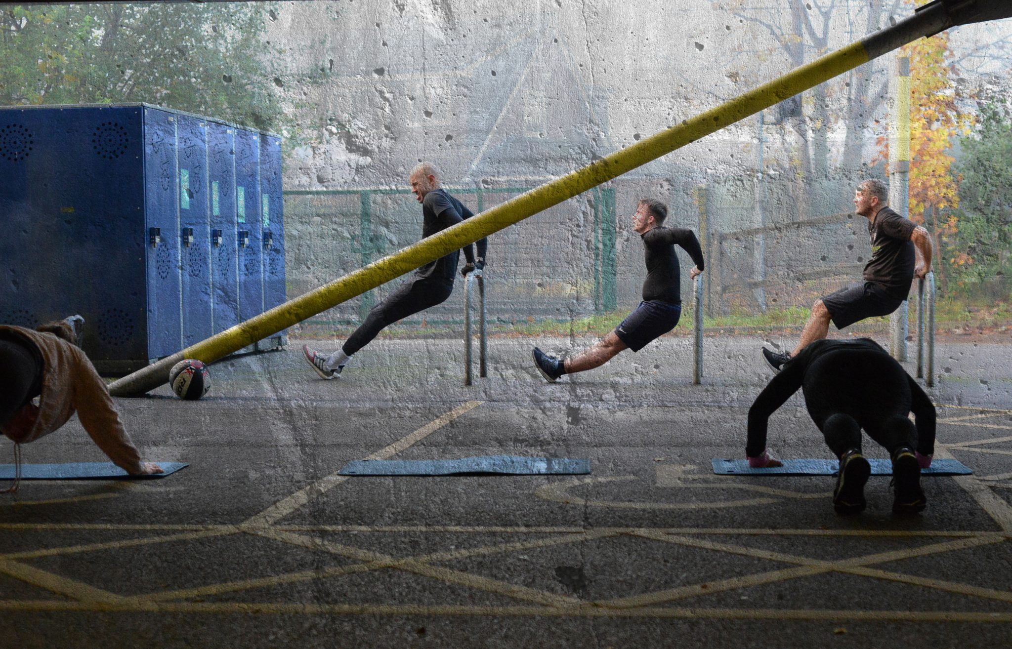
Concrete textures layered with real training photography gave the brand a grounded feel, avoiding anything too polished or artificial. The aim was to reflect the reality of the sessions and the people behind them, not create something that felt manufactured.
Working alongside Swish Films, video content was produced to capture the energy of the training and the mindset behind the brand, helping bring everything together visually.
What happened next
Like many businesses, timing had other ideas. Plans to launch a new gym space were put on hold when COVID hit, making it impossible to move forward in the way originally intended.
But the brand didn’t disappear. It adapted.
BoxRooms continued running sessions outdoors, using local spaces and maintaining the community that had been built over the years. The foundations were still there, just waiting for the right moment to move forward again.
What came out of the project was more than just a logo. It was a brand with direction. Something that felt true to its roots but ready for what comes next. The gym may be on hold, but the identity is in place, ready for when the time is right.
Some businesses wait until everything is perfect before investing in their brand. Others build the brand first, so they’re ready when the opportunity comes.
Related Projects