Rebranding an SEO Agency
Growth is a good problem to have.
But when your brand no longer reflects where your business is, it can start to hold you back. That’s exactly where Cure Digital found themselves.
Cure Digital are an SEO agency we collaborate with regularly. While we focus on designing and building websites, they focus on driving performance through SEO — a partnership that works well for both sides. Over a short period of time, their business had grown quickly. Their reputation had strengthened, their client base had expanded, and the level they were operating at had moved up. The problem was, their branding hadn’t kept pace. It no longer reflected the quality of their work or the direction the business was heading.
Rebranding isn’t about change for the sake of it. It’s about aligning how a business looks with where it actually is. For Cure Digital, the starting point was simple — build a brand that felt more confident, more refined and more in line with their positioning as a results-driven SEO agency. We took inspiration from their tagline, “make it better”, and used that as a foundation for the creative direction. The aim was to create something that felt progressive and trustworthy at the same time.
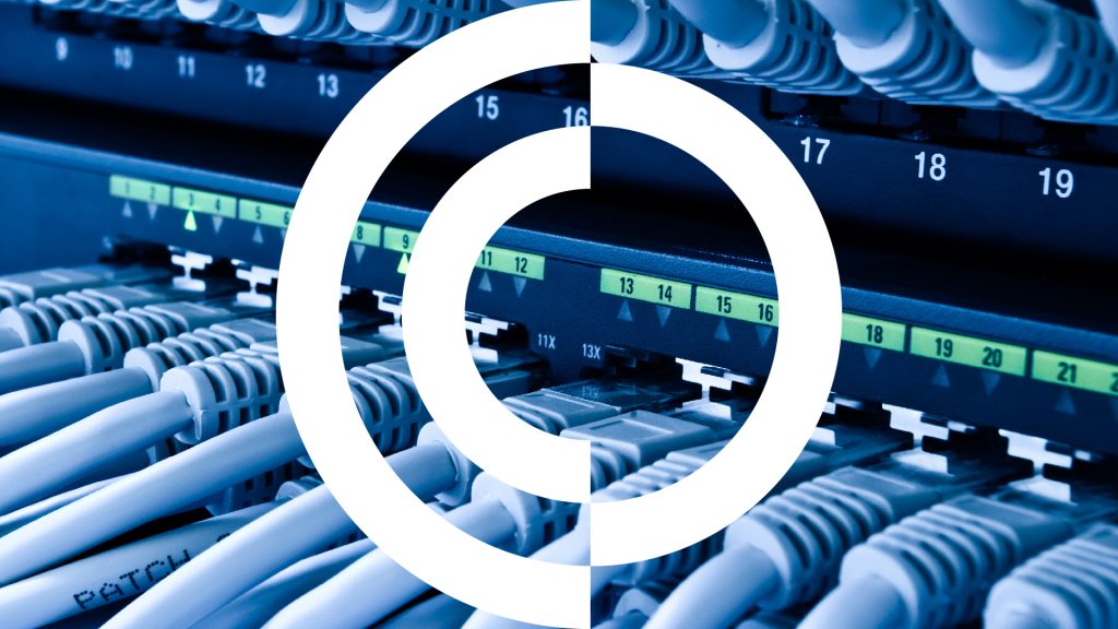
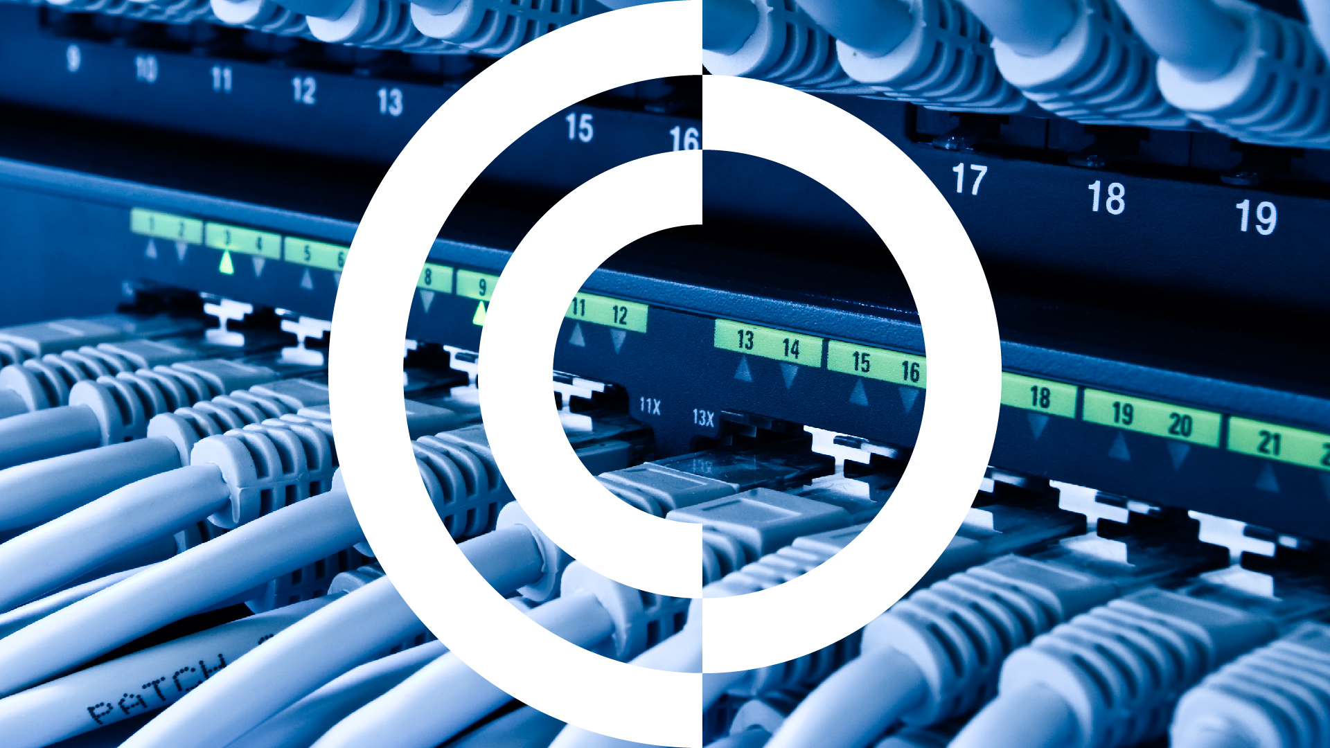
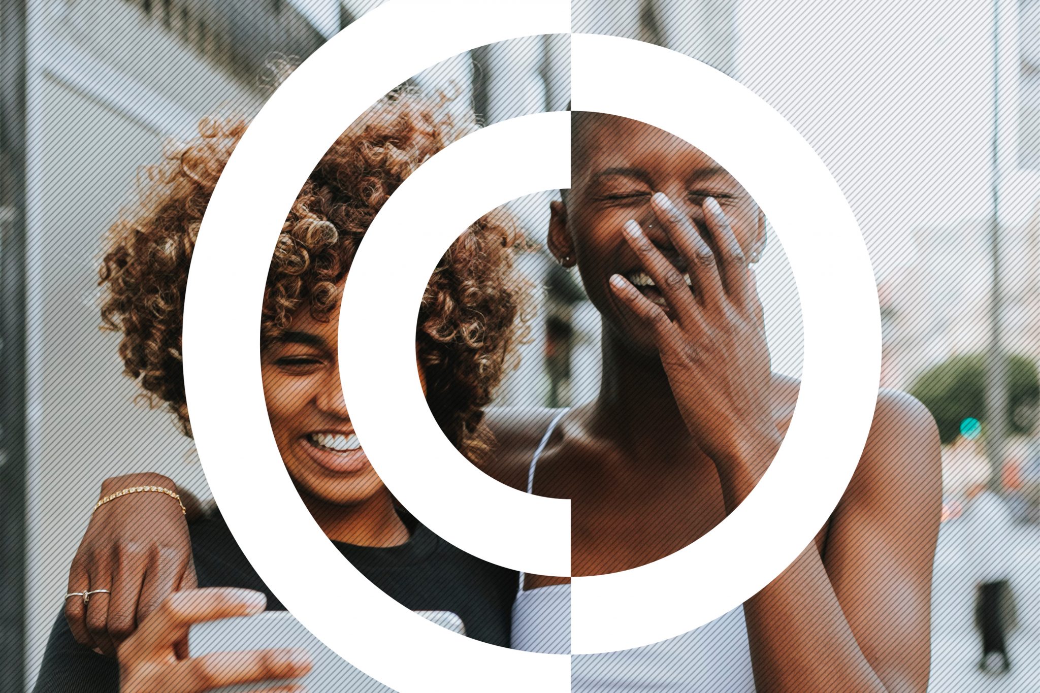
The solution came through a monogram-style logo, built from the letters C and D. The natural curves of each letter allowed us to create a clean, balanced icon that feels strong and recognisable without being overcomplicated. It works just as well as a standalone mark as it does within the full logo — giving the brand flexibility across different applications.
This is important. Because a good brand doesn’t just live on a website — it needs to work everywhere.
Bringing the brand to life
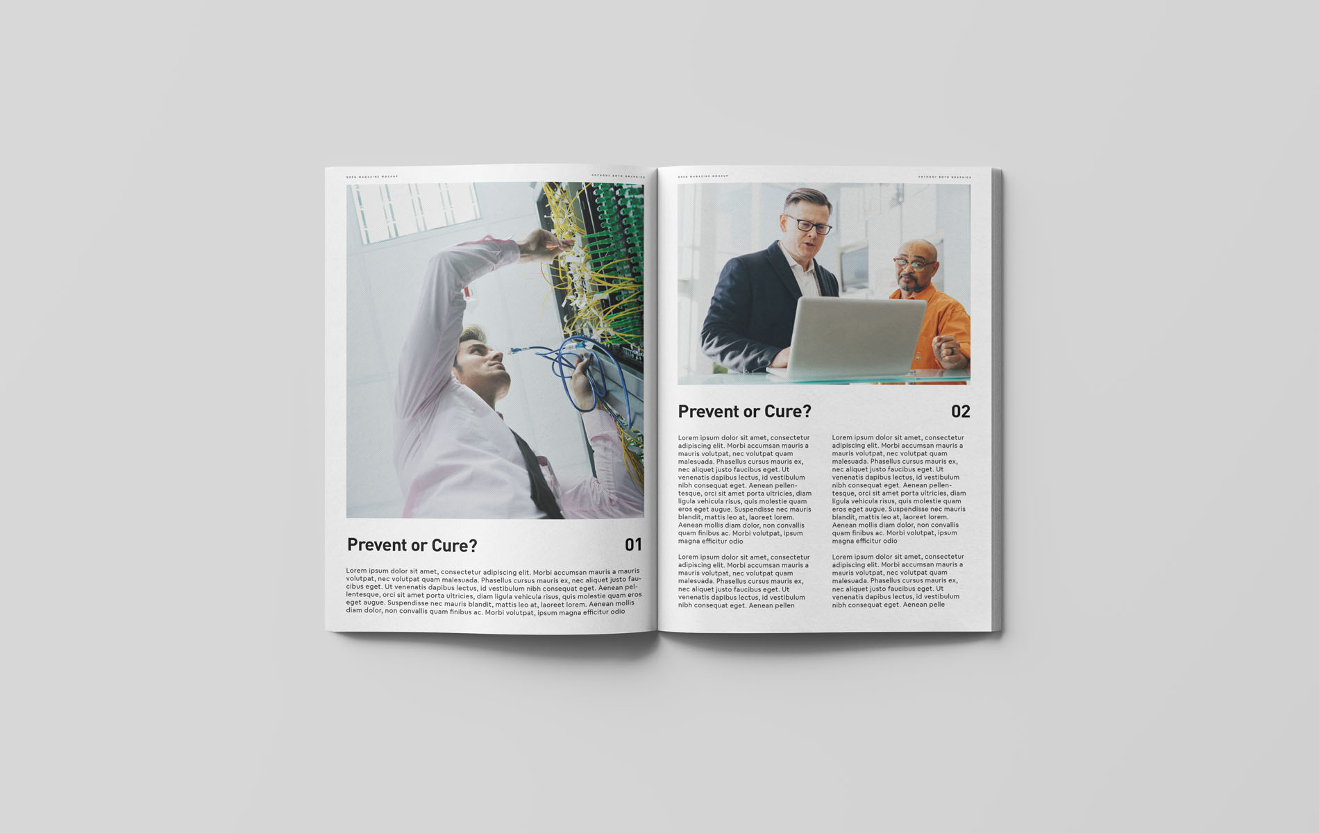
Once the core identity was signed off, we moved quickly into real-world application. The brand was rolled out across exhibition materials such as pop-up banners, stationery and various other marketing collateral.
The bold icon allowed the brand to stand confidently on its own, particularly in environments where attention is limited and competition is high. Consistency across all touchpoints helped reinforce the identity and create a more professional, established presence. The rebrand gave Cure Digital a visual identity that matched their level as a business. More confidence and recognisable… more aligned with the quality of their work.
It’s a good example of what happens when branding catches up with growth. This is the kind of project we enjoy most — helping a business present itself properly. We’re looking forward to seeing how the Cure Digital brand continues to evolve.


You will never get a second chance at a first impression.
You will never get a second chance at a first impression.
You will never get a second chance at a first impression.
You will never get a second chance at a first impression.
Related Projects